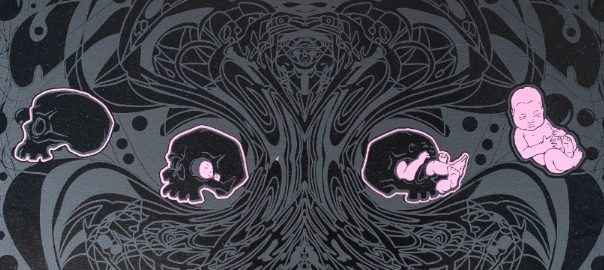
Get in on this limited-run printing project collab between FLOAT and artist Sean Shinnock, with a portion of proceeds going to local OCD advocacy group Hard Quirk.
Continue reading Project Skullbaby

Get in on this limited-run printing project collab between FLOAT and artist Sean Shinnock, with a portion of proceeds going to local OCD advocacy group Hard Quirk.
Continue reading Project SkullbabyWe are so close to being finished! The place is starting to look like something real. Our contractor is down to the last little details, and we’ve turned our attention from structural things like ceilings and walls, to putting together a whole lot of IKEA cabinets and furniture… and building the tanks themselves!
The Escape Pod tanks are built; an inspector came out to look at our setup and gave our guys a few notes and changes to make. They got right to work on that, and we’re one step closer to our general inspection. We’re waiting for our electrician to wire the pumps and then we’ll plug it all in. I made a gif of the building process… Continue reading Construction progress 4
You may have noticed that the word “massage” is missing from recent iterations of our logo. When Colin and I were looking at potential spaces for the float center, we were finding spaces that were either half the size we needed, or four times too large. There wasn’t a lot in between.
After thinking about it, talking about it, and floating on it, we decided to go with a smaller footprint, and keep my massage office separate from the float business.

I think this will be a fine decision for Float, going forward. We’ll be able to concentrate on promoting flotation therapy as the unique and exciting thing it is.
We will be doing business as Float Boston, with the tagline “Flotation Therapy.” We’ll be fixing our branding over the next few weeks to reflect this. You may get notifications from facebook and other platforms as they process the change.
Thanks again for your support!
We found our designer Jennifer Mangini Perry through my friend Amber, whose cool kettlebell logo I’d admired. I looked through her work, liked her aesthetic a lot, and asked her if she could work something up for us. Jen talked with us, got a sense of the business and what we are like as people, and then took all of our ideas and came up with something we love!

Colin and I both love the logo’s clean, restful look. The upward-drifting droplet really grabbed me, and I like that this will be our central image. (We asked Jen to do a bunch of nitpicky things on the way to the finished product, including trying out the droplet as the O in Float… but that just made it look like our name was “Flat.”) You’ll see the droplet used in different ways in the future.
I’m really excited to have Jen’s work be the face of our brand. We’ll be rolling this out to all of our platforms in the next week or so.